Fourteen Years of Service
Posts: 18,857
Threads: 2,029
RE: Some of my works... 10-04-2012, 05:05 AM
#2
Had to remove one, as per our guidelines on advertising. No warning will be issued.
![[+]](https://sinister.ly/images/modern/collapse_collapsed.png) •
•
Thirteen Years of Service
Posts: 35
Threads: 6
RE: Some of my works... 10-04-2012, 05:07 AM
#3
Oh the [redacted] one haha...not even doing that anymore...I am part of another forum now. I was just showing for the gfx side of it :facepalm:
•
Thirteen Years of Service
Posts: 198
Threads: 37
RE: Some of my works... 11-03-2012, 10:56 PM
#4
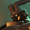
I like them but there's a lot of room for improvement, such as the third one, it seems to have too much 'color contrast' which makes it difficult to work out what it says - might just be me but I think it's difficult to make out what it does say.
•
Thirteen Years of Service
Posts: 47
Threads: 4
RE: Some of my works... 11-04-2012, 12:24 AM
#5
You should probably work on your lightning and basic effects. Logos/Banners can be basic, but you still want it to look nice and/or sleek. You might want to also include the background color you feel it would match best with, the gray of the forum doesn't really do well for the transparent images.
•
Thirteen Years of Service
Posts: 131
Threads: 9
RE: Some of my works... 11-04-2012, 01:26 AM
#6
Admin userbar looks nice but it needs more work but that first one u took from HF...
•
Thirteen Years of Service
Posts: 24
Threads: 4
RE: Some of my works... 12-26-2012, 11:14 PM
#7
Those all look really nice!
It wasn't raining when Noah built the ark.
-Howard Ruff
Then I saw it, I saw a mom who would die for her son, a man who would kill for his wife, a boy, angry & alone, laid out in front of him the bad path. I saw it & the path was a circle, round & round. So I changed it.
- Joe from Looper
•
Thirteen Years of Service
Posts: 9
Threads: 0
RE: Some of my works... 01-01-2013, 10:04 AM
#8
These are rather impressive, not bad, not bad at all.
•


![[Image: j3BCN.png]](http://i.imgur.com/j3BCN.png)
![[Image: logo.png]](http://www.eforums.tk/images/devilos/logo.png)
![[Image: g7Kzm.png]](http://i.imgur.com/g7Kzm.png)
![[Image: DFEVA.png]](http://i.imgur.com/DFEVA.png)
![[Image: CBCpT.png]](http://i.imgur.com/CBCpT.png)
![[Image: IfWOV.png]](http://i.imgur.com/IfWOV.png)
![[Image: DoM4v.png]](http://i.imgur.com/DoM4v.png)


![[Image: 7ajmN5P.jpg]](https://i.imgur.com/7ajmN5P.jpg)


![[Image: lupado1c3f2.png]](http://www.auplod.com/u/lupado1c3f2.png)