Login Register


wtf filter_list
Author
Message
wtf #1
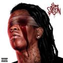
[Image: HgLnJLF.png]

lol are you for real with this shit?

Reply

RE: wtf #2
I wanted to post a thread about the same thing but I didn't want to get banned. I agree, that thing is shit and doesn't go with anything whatsoever.
XMPP - wrath@xmpp.jp

Reply

RE: wtf #3
I want to throw up. This is the ugliest thing I've seen in years.

Reply

RE: wtf #4
I dislike the way the logo look kinda squashed.
[Image: master645.png]

ā€œLife before death, strength before weakness, journey before destination.ā€ ― The Way of Kings by Brandon Sanderson

Reply

RE: wtf #5
(06-11-2015, 01:07 AM)Kitsune Wrote: looks like islitmywrists.ly
It's often the outcasts, the iconoclasts ... those who have the least to lose because they
don't have much in the first place, who feel the new currents and ride them the farthest.

Reply

RE: wtf #6
@Oni

The font looked good on the concept for the new theme, but yeah, it doesn't suit our current one.

Reply

RE: wtf #7
I personally think this looks pretty nice. I have different tastes then everyone else. But you cant be picky there is far too many members on here for Oni to satisfy all. Sometimes decisions have to be made weather its liked or not to improve the community.

While a logo could be voted on, in my opinion its whatever.

Reply

RE: wtf #8
Clearly Oni is preparing for the merge with Emo Forums.

[+] 1 user Likes Lain's post
Reply

RE: wtf #9
HE DIDNT LISTEN

Code:
[10.06.2015 08:48:50] Oni | SL: When I swap the theme I'll change the material [10.06.2015 08:49:09] Yagmii: Oh god [10.06.2015 08:49:11] Yagmii: when you hover [10.06.2015 08:49:24] Yagmii: old one was best [10.06.2015 08:49:57] Oni | SL: what happens on hover [10.06.2015 08:50:03] Oni | SL: the rest of the logo is exact same [10.06.2015 08:50:04] Yagmii: it changes to old one [10.06.2015 08:50:11] Oni | SL: Yeah nah [10.06.2015 08:50:14] Oni | SL: That's caching [10.06.2015 08:50:15] Oni | SL: being gay [10.06.2015 08:50:18] Yagmii: Yeah [10.06.2015 08:50:19] Yagmii: and I’m saying [10.06.2015 08:50:21] Yagmii: the old one [10.06.2015 08:50:22] Yagmii: is better

Reply

RE: wtf #10
The old logo looked cleaner, more professional.

Reply


Users browsing this thread: